Forum Replies Created
-
AuthorPosts
-
goutresolve
ParticipantThat’s exactly what I needed. Thank you so much.
ParticipantNailed it! Thank you so much!
ParticipantThank you for the help. I really appreciate it.
That actually looks really good and upon initial inspection there a couple issues:
The “sale” badge is floating on the right side of the thing instead of it being attached to the left side
There still aren’t any product boxes around these. Not sure if that was addressed or not.ParticipantAlso, I just noticed that when I implement that code that it makes the images in my ingredients table really small when viewing on desktop. When I take the @media all… bit of code out it fixes that problem but then when I’m on mobile the product layout gets messed up. Any way to have it do both?
And one final thing, is there a way to get rid of the little dash that’s above the product image?
ParticipantSorry for taking so long to respond. That seems to have helped the formatting between desktop and mobile. Here is the test page that I’m working on. The code is at the bottom. http://www.GoutResolve.com/home-test
Here are the tweaks I’m trying to do now.
I’d like to make borders around each of the divs so that each product has its own box. How would I do that?
I’d like to center the products and text over the “add to cart” button. I had previously used this code and it stopped working when I implemented the code above. Any idea how to implement it so that both things work?
.woocommerce ul.products li.product a img,
.woocommerce-page ul.products li.product a img
{margin: 0 auto 8px}.woocommerce ul.products li.product h3,
.woocommerce-page ul.products li.product h3
{text-align:center}.woocommerce ul.products li.product a,
.woocommerce-page ul.products li.product a
{margin:0 0 0 18%; min-width:100px; width: 50%; text-align:center}Last, I’d like to make the products themselves bigger. When viewing on mobile they are perfect but when viewing on desktop they are really small. Any way to make them larger?
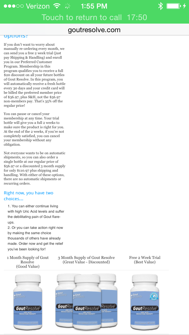
ParticipantSo, our site was recently flagged by Google as not being “mobile friendly” and so I’d like to get some help. I removed the code that disabled the mobile view and I’m having one issue. At the bottom of the page I have a table and I can’t get it to shrink when viewing it on mobile. I don’t know if this is a Tablepress plugin issue or if it’s a theme issue.
Ideally, what I’d like to do is have one version of the table that has the 3 products side by side when viewed on a desktop and another version of the table that has the products on top of each other when viewed on a mobile device. Do you know how to do something like this?
My website is http://www.GoutResolve.comParticipantThat worked. Thanks!
ParticipantNever mind. I just looked and everything looks good other than now my menu takes up two lines instead of just one. I can figure that out (I think).
Thank you so much for figuring this out!
ParticipantWill that mess with the other tweaks that I’ve done? I have copied the current tweaks that I’ve done on the site.
.home .entry-title {
display: none;
}#logo {
width: inherit;
}body, #wrapper {
min-width: 950px !important;
}#site-description {
font-size:145%;
color: #000;
font-align:center;
}h1{
font-size: 200%;
color: #09f;
}h2{
color: #09f;
font-weight: bold;
}h3{
color: #000;
}.tablepress-id-3 tbody td {
vertical-align: middle;
}.tablepress-id-4 tbody td {
vertical-align: middle;
}.tablepress-id-7 tbody .column-1 {
background-color: #ddd !important;
}
.tablepress-id-7 tbody .column-2 {
background-color: #ddd !important;
}.tablepress img {
max-width: none !important;
}ul{
font: inherit;
}ParticipantIt didn’t change anything. I have attached 2 screen shots of the site. The top one is the top of the site. The bottom one is where the issue is being introduced (I believe). We have this table at the bottom that needs to be a certain size and used some code to make sure it doesn’t get adjusted.
http://www.goutresolve.com/wp-content/uploads/2014/06/IMG_0071.pnghttp://www.goutresolve.com/wp-content/uploads/2014/06/IMG_0072.png
ParticipantAll that seemed to do was move the menu bar to the middle of the page.
My website is http://www.goutresolve.com
I want it so that there is no mobile view. Want it all to look the same on desktop and mobile. It’s a very basic site so I wouldn’t think that should be a problem as far as functionality.ParticipantThat worked! I tried to do that before and only used the “preview changes” button but that didn’t work. It wasn’t until I actually “updated” the page that the side bars went away. Thanks so much!
ParticipantI updated Chrome on my Mac and it appears (fingers crossed) to have fixed the problem.
ParticipantI have a late 2011 Macbook Pro and Chrome running Version 33.0.1750.152
I also have a new HP something or other running Windows 7 and Chrome running version Version 33.0.1750.154 and it had the problem. I just updated to version 34.0.1847.116 m and that seems to have fixed the issue on the PC.
No update for the Mac yet though.I don’t know what’s going on. Very weird. Here is a screenshot of what it looked like on my Mac.
 Participant
If I open an incognito window in Chrome and go to the website it will not display the headings every singe time. As soon as I hit the home button on our navigation bar it will reload the page and show the headings.
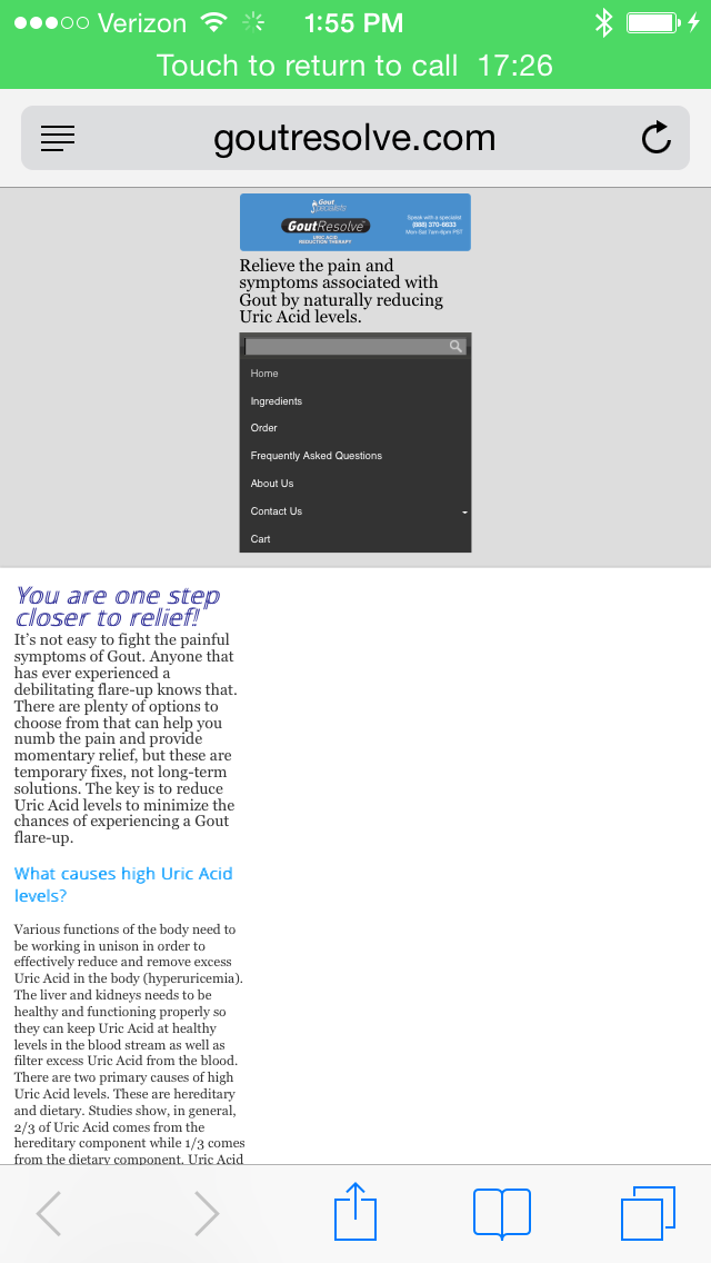
ParticipantMy website is http://www.goutresolve.com
It seems very hit and miss with the headings showing up and disappearing. Thank you in advance for your help.
ParticipantI am having the same problem on my site. Is there anything that we can do to fix it or work around it? I’d hate to have someone visit my site and not see any of the headings on my page as they are crucial to the design of my site.
ParticipantAll that seemed to do was move the logo image down. My website is goutresolve.com and I’m using Startup Pro.
Additionally, when that code is inserted, the logo image doesn’t show up in Internet Explorer or Firefox. When I remove it, the site appears as it should. -
AuthorPosts