Home › Forum › Customization › Disable Mobile Theme
Tagged: Disable Mobile Theme
- This topic has 10 replies, 2 voices, and was last updated 11 years ago by
StartupWP.
-
AuthorPosts
-
June 4, 2014 at 12:55 PM #1637
StartupWP
KeymasterStart with:
#wrapper {
  min-width: 1000px;
}
https://startupwp.com/topic/customizing-your-theme/
And if you need further help, please share a link to your website where there’s an example of the table issue.
Thank you.
June 4, 2014 at 1:47 PM #1638goutresolve
ParticipantAll that seemed to do was move the menu bar to the middle of the page.
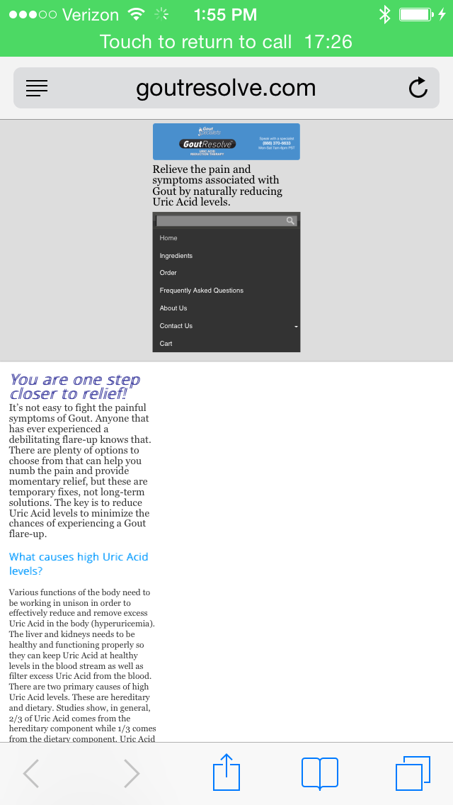
My website is http://www.goutresolve.com
I want it so that there is no mobile view. Want it all to look the same on desktop and mobile. It’s a very basic site so I wouldn’t think that should be a problem as far as functionality.June 5, 2014 at 1:05 PM #1640KeymasterJust looked over your site and it appears the CSS solution is working fine, you might need to clear all caches and restart your browser.
You may also try:
body, #wrapper {
  min-width: 1000px !important;
}
If that’s still a no-go, can you please share a screenshot of what you’re seeing?
Thank you.
June 5, 2014 at 2:45 PM #1642ParticipantIt didn’t change anything. I have attached 2 screen shots of the site. The top one is the top of the site. The bottom one is where the issue is being introduced (I believe). We have this table at the bottom that needs to be a certain size and used some code to make sure it doesn’t get adjusted.
http://www.goutresolve.com/wp-content/uploads/2014/06/IMG_0071.pnghttp://www.goutresolve.com/wp-content/uploads/2014/06/IMG_0072.png
June 6, 2014 at 9:55 AM #1644KeymasterWe took a closer look and wrote up a doc on it:
https://startupwp.com/topic/turn-off-responsive-design/
Hopefully, that’ll do the trick. :)
June 6, 2014 at 9:58 AM #1645ParticipantWill that mess with the other tweaks that I’ve done? I have copied the current tweaks that I’ve done on the site.
.home .entry-title {
display: none;
}#logo {
width: inherit;
}body, #wrapper {
min-width: 950px !important;
}#site-description {
font-size:145%;
color: #000;
font-align:center;
}h1{
font-size: 200%;
color: #09f;
}h2{
color: #09f;
font-weight: bold;
}h3{
color: #000;
}.tablepress-id-3 tbody td {
vertical-align: middle;
}.tablepress-id-4 tbody td {
vertical-align: middle;
}.tablepress-id-7 tbody .column-1 {
background-color: #ddd !important;
}
.tablepress-id-7 tbody .column-2 {
background-color: #ddd !important;
}.tablepress img {
max-width: none !important;
}ul{
font: inherit;
}June 6, 2014 at 10:02 AM #1646ParticipantNever mind. I just looked and everything looks good other than now my menu takes up two lines instead of just one. I can figure that out (I think).
Thank you so much for figuring this out!
June 7, 2014 at 1:03 PM #1648KeymasterYou’re welcome, we’ll be here when you need us. :)
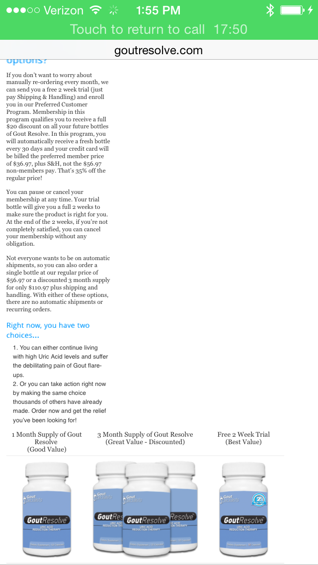
March 3, 2015 at 8:34 AM #2160ParticipantSo, our site was recently flagged by Google as not being “mobile friendly” and so I’d like to get some help. I removed the code that disabled the mobile view and I’m having one issue. At the bottom of the page I have a table and I can’t get it to shrink when viewing it on mobile. I don’t know if this is a Tablepress plugin issue or if it’s a theme issue.
Ideally, what I’d like to do is have one version of the table that has the 3 products side by side when viewed on a desktop and another version of the table that has the products on top of each other when viewed on a mobile device. Do you know how to do something like this?
My website is http://www.GoutResolve.comMarch 3, 2015 at 8:45 PM #2163KeymasterLike most validation tools, they’re only accurate and useful to a point. Visually, a website might be perfectly responsive, but to the Google crawler it might be looking for signals that generally imply mobile support that aren’t being used.
Trust your own eyes and judgments over an automated tool when it comes to these kinds of issues. When the real mobile devices aren’t handy, tools like this are fairly good:
http://quirktools.com/screenfly/
This should fix your header:
#logo {
  width: 100% !important;
}
As for your table, the way the table is assembled it doesn’t look like it’ll be able to be responsive. Since this is a bit off-topic, go ahead and start a new topic and we’ll work on a better solution for displaying your products.
Thank you.
-
AuthorPosts
- You must be logged in to reply to this topic.